Maclyn
Agency Rebrand
Creative Director & Motion Designer
With over 20 years of serving clients local and abroad, Maclyn’s brand was in need of a refresh. As a small agency based in the suburbs of Chicago, they needed to position themselves and their work in a way that could go round-for-round with the best of ‘em.
The Challenge
It’s not uncommon for agencies to struggle with their brand. What do we look like? What do we sound like? For Maclyn, there were holdovers from the visions of previous Creative Directors that felt dated and no longer represented who they were as an agency.
Having self-initiated the project, I braced for resistance to this change by approaching the project as more of an evolution, not a revolution. Being the new(er) guy on the block, I knew that it was important to maintain the overall feel of the brand while bringing it into a space that amplifies how they present themselves and the work they have done for their clients.
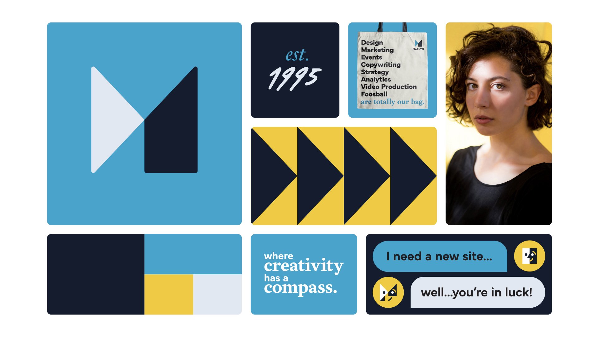
The Mark
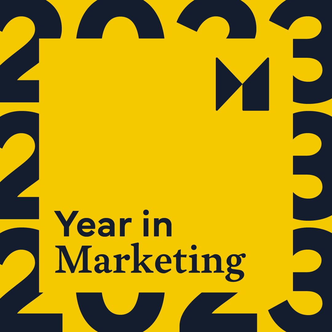
Taking inspiration from the agency’s tagline and North Star “Where Creativity has a Compass”, I started by adjusting the logo mark. This involved retaining similar shape language to the old mark, while bringing in an arrow to complete the M monogram, an element that would act as a repeating graphic throughout Maclyn’s new brand.
The mark and updated logotype were meticulously nudged, scaled, and tweaked to ensure visual balance and consistency in both horizontal and vertical orientations.


The Brand
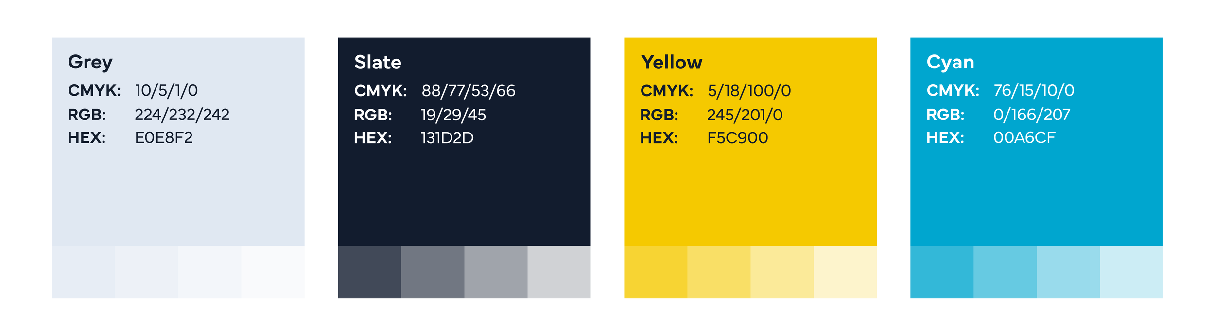
The established blue and yellow color palette wasn’t going anywhere, but it needed some adjusting. Their pale yellow was swapped for a more vibrant hue and a pale blue was added to create more depth and contrast. The result opened up opportunities for highly-graphical layouts that feature bold typography and intentional color-blocking.
As a graphic through-line, I brought in the arrow from the mark to further reinforce messaging and guide the viewers eye towards calls-to-action or even serve as a container for client logos.


Bringing it all together
In addition to the mark, palette, and typography, I envisioned how the brand might extend to company photography, iconography, micrographics, and even animation. The result is a modern, punchy, and flexible visual identity that figuratively and literally moves the agency forward.